Why I use Cyanotype and other questions
I received an email from an art student recently, saying that she liked my work, and asking if I would answer a few questions as part of her studies.
It was quite nice to take some time to think about her queries. Here is the resulting Q&A:
G. Why did you choose flowers as your subject matter and why did you pick certain flowers? (Tulips, agapanthus, peonies)
R. I have always loved plants and flowers. My father and grandfather were seed merchants and some of my earliest memories are being in the garden and my dad teaching me how to plant out seedlings and cuttings.
When I think of early influences I remember how much I loved the Nature Table at school. These were really popular in schools in the 60s and 70s and contained small natural items that the children had found, such as flowers and seedheads, feathers and eggshells. It was one of the few places I felt comfortable in the not very enjoyable atmosphere of primary school.
I have always been inspired by artists who use plants and flowers in their work, from Caravaggio to the Dutch still life painters, right up to the photos of Robert Mapplethorpe, Cy Twombly and beyond.

Caravaggio. Detail. Boy bitten by Lizard 1595

Robert Mapplethorpe - Calla Lily 1984
I think of the flower studies in the same way as I do my portraits, and I want the flowers to have the same presence as a person.
Re why I use the flowers I do? I grow my own flowers or get them from UK growers where possible. I always approach things from a sculptural perspective, so I look for subjects with a defined form that I can explore and bring out. But basically it is seeing some aspect of the flower or plant that I am seduced by, and that I want to share.
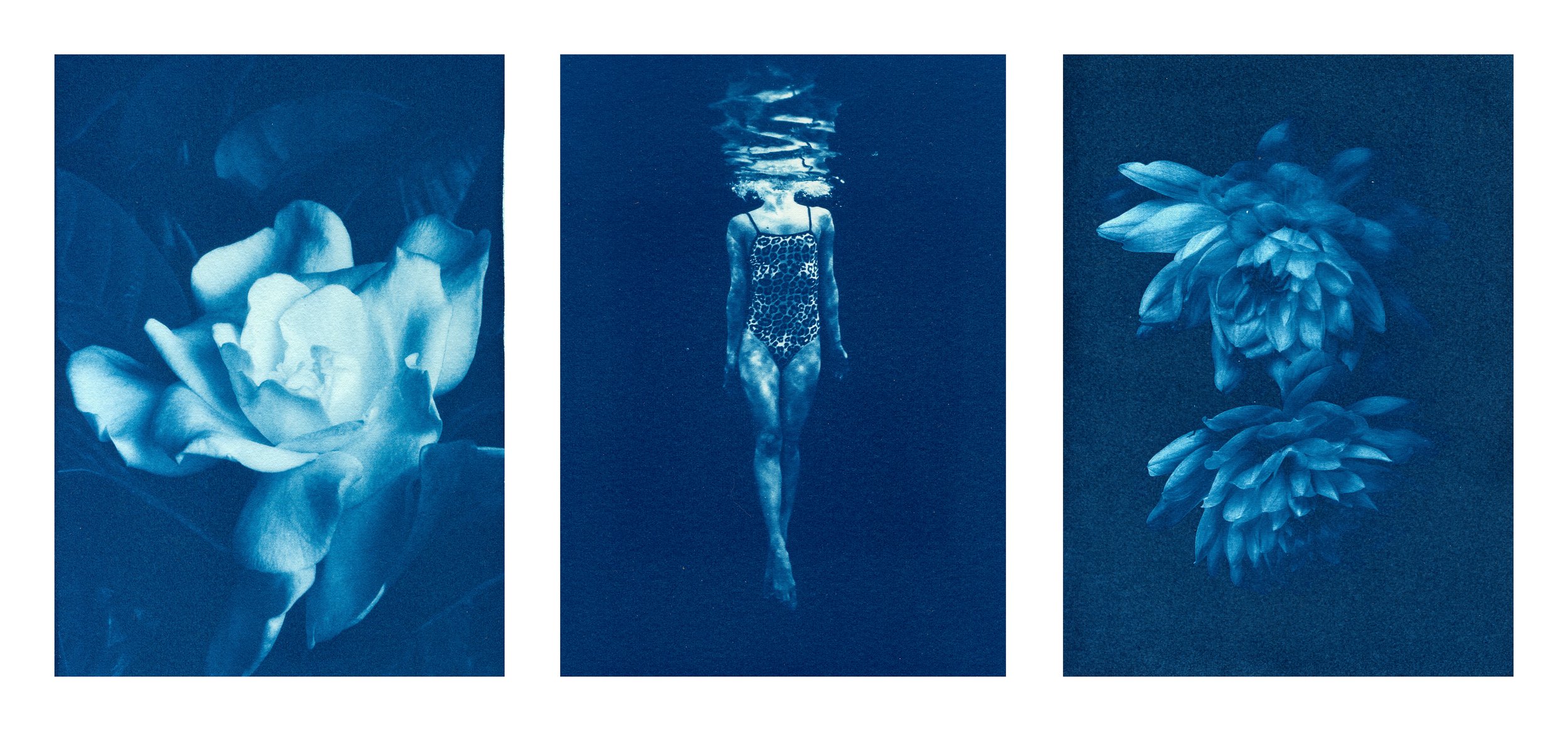
The flower head below for example was so appealing to me. I had photographed a tightly packed Agapanthus bud the year before and loved its formal regularity. However when I saw this half open Agapanthus I was completely smitten by the wild and chaotic tangle of petals.

Agapanthus II 2021
G. Do you have previous experience with the cyanotype method and is it particularly meaningful or important to the final print?
R. I learned cyanotype with an alternative process printmaker called Terry King about 30 years ago, but hardly used it again until I started making my swimmer prints. I chose to begin again with it because it is cheap, relatively non-toxic and quite easy to get a half decent image, and I thought the blue would work well with the theme of water. I planned to move quickly onto platinum printing, but actually I fell in love with the process of cyanotype and the blue colour itself. I like the way it abstracts the picture in some way.

Swimmer II 2020
G. What process do you follow when creating the prints? What camera do you use? Do you edit the photographs before printing?
R. I use various cameras, both film and digital, but primarily a Nikon D800e. It's been superseded by several generations of cameras now, but it is still a fantastic studio workhorse which makes beautiful high resolution files.
I edit the photos in Lightroom and Photoshop. I convert to black and white in LR, and adjust the tones and crop. I spend the most time selecting the image I want and adjusting the tones. With cyanotype you can change the image a lot, paint things in out, and it is very forgiving in the way that a digital print isn't. I do any remaining detail work on Photoshop and then use a curves layer, flip the image horizontally and invert it to make a negative.
G. Have you experienced printing on different types of paper? And why do you prefer to print on cotton rag?
R. I printed on cartridge paper for economy when I started. It gave good results, and is surprsingly stable. The older prints on it still look good. Not all papers are suitable for cyanotype because the alkaline buffering used can eventually cause the blues to fade a little (or a lot.)
I have also used Arches watercolour paper. I liked the Not HP surface because it was so textured. The cyanotypes themselves look a bit like watercolours and this effect was complemented by the paper. However I settled on the Arches Platine cotton rag in the end because it makes the most beautiful seductive blues. (Unfortunately it is also one of the most expensive papers!!)

Hyacinths 2023
If you would like to know more about my work feel free to ask questions via my contact form.
To receive updates about prints, exhibitions, and studio sales or offers, subscribe to my newsletter below!